Documentation has moved
This documentation is not maintained anymore.
Find the new documentation here:
https://support.lewe.com/docs/chart-js-for-confluence-manual/
Pie Chart
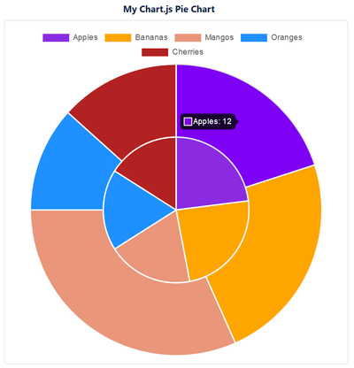
Screenshot
Description
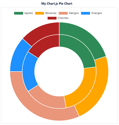
The Chart.js Pie Chart macro can show several data sets. Each value is shown as a slice with a different color. You can select whether to show the chart as a pie or a doughnut.
Adding the Macro
Edit your page.
Select "+" => Other macros
Type in "Chart.js" in the Search box
Select the "Chart.js Pie Chart" macro
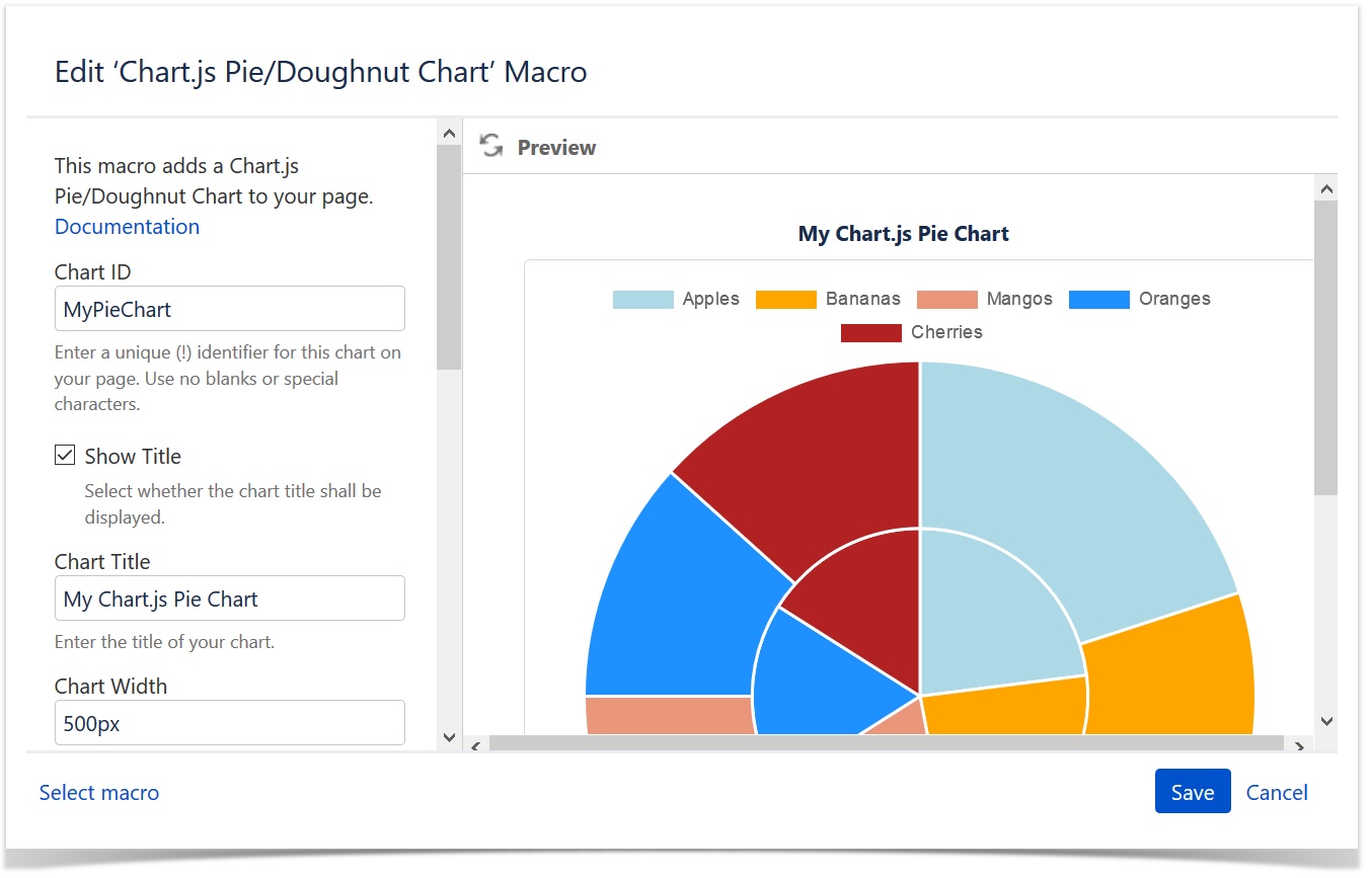
Enter and select the options of the macro
Click INSERT
Put your data table in the macro body
Save the page
Macro Options
| Option | Description |
|---|---|
| Chart ID | Enter a unique identifier for this chart on your page. If you use more than one Chart.js chart on your page, make sure that each one of them has a different Chart ID. Use no blanks or special characters. |
| Show Title | Switch on or off the display of the chart title. If switched on (default), the title is shown above the chart's matrix as shown in the screenshot above: "My Chart.js Bubble Chart". |
| Chart Title | Enter the title of the chart. You can chose to display it or not by the "Show Title" checkbox. |
| Chart Width | This value defines the width of the chart block. The chart itself will adjust to this size. You can enter a pixel (e.g. "500px") or a percentage (e.g. "100%") value. A pixel value will make the block exactly that size, a percentage value refers to the parent block, e.g. a Confluence page section. The default is "500px". Enter the value without the quotes. |
| Chart Border Width | The chart can have a border if you want so. Enter the size of it here in pixel. Enter just the number without the "px", e.g. "1". The default is "1". Enter the value without the quotes. |
| Chart Border Color | If you chose to display a border around the chart, you can enter the color of it here. Enter the hex value of the color starting with a "#", e.g. "#d7d7d7". Enter the value without the quotes. |
| Show as Doughnut | Check this option to show the chart as a doughnut. |
| Aspect Ratio | With this option switched on, you can force the height to be the same as the width of the chart (square display). |
| Show Legend | Select whether you want to show the legend or not. |
| Legend Position | Select where to show the legend. |
| Show Tooltips | Select whether you want to show the tooltips when hovering a bubble or not. |
| Show Data Table | Select whether you want to show the data table of the macro body in the page view or not. |
Data Table
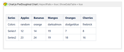
The macro requires a table with your data in the macro body.
Format
| Series | <slice1-label> | <slice2-label> | <slice3-label> | <slice4-label> | ... |
|---|---|---|---|---|---|
| Color | Color of slice 1 | Color of slice 2 | Color of slice 3 | Color of slice 4 | ... |
| Series1 | Value of slice 1 | Value of slice 2 | Value of slice 3 | Value of slice 4 | ... |
| ... |
Example
| Series | Apples | Bananas | Mangos | Oranges | Cherries |
|---|---|---|---|---|---|
| Color | random | orange | darksalmon | dodgerblue | firebrick |
| Series1 | 12 | 14 | 19 | 7 | 8 |
| Series2 | 23 | 24 | 19 | 18 | 16 |
Header Row
The table must have a header row. The first cell is ignored. The rest are used to label each slice of the chart.
Color Row
The table must have a second row where the macro expects to find the colors of each slice. The first cell is ignored.
Value Rows
Each following row contains the name of the series in the first column and its slice values in the subsquent columns.