Documentation has moved
This documentation is not maintained anymore.
Find the new documentation here:
https://support.lewe.com/docs/chart-js-for-confluence-manual/
Line Chart
Screenshot
Description
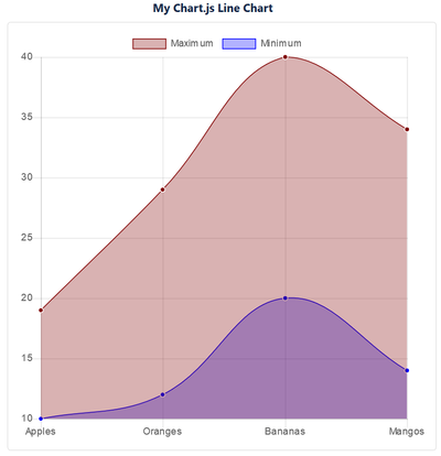
The Chart.js Line Chart macro can show several data sets, each of them as lines or filled line areas.
Adding the Macro
Edit your page.
Select "+" => Other macros
Type in "Chart.js" in the Search box
Select the "Chart.js Line Chart" macro
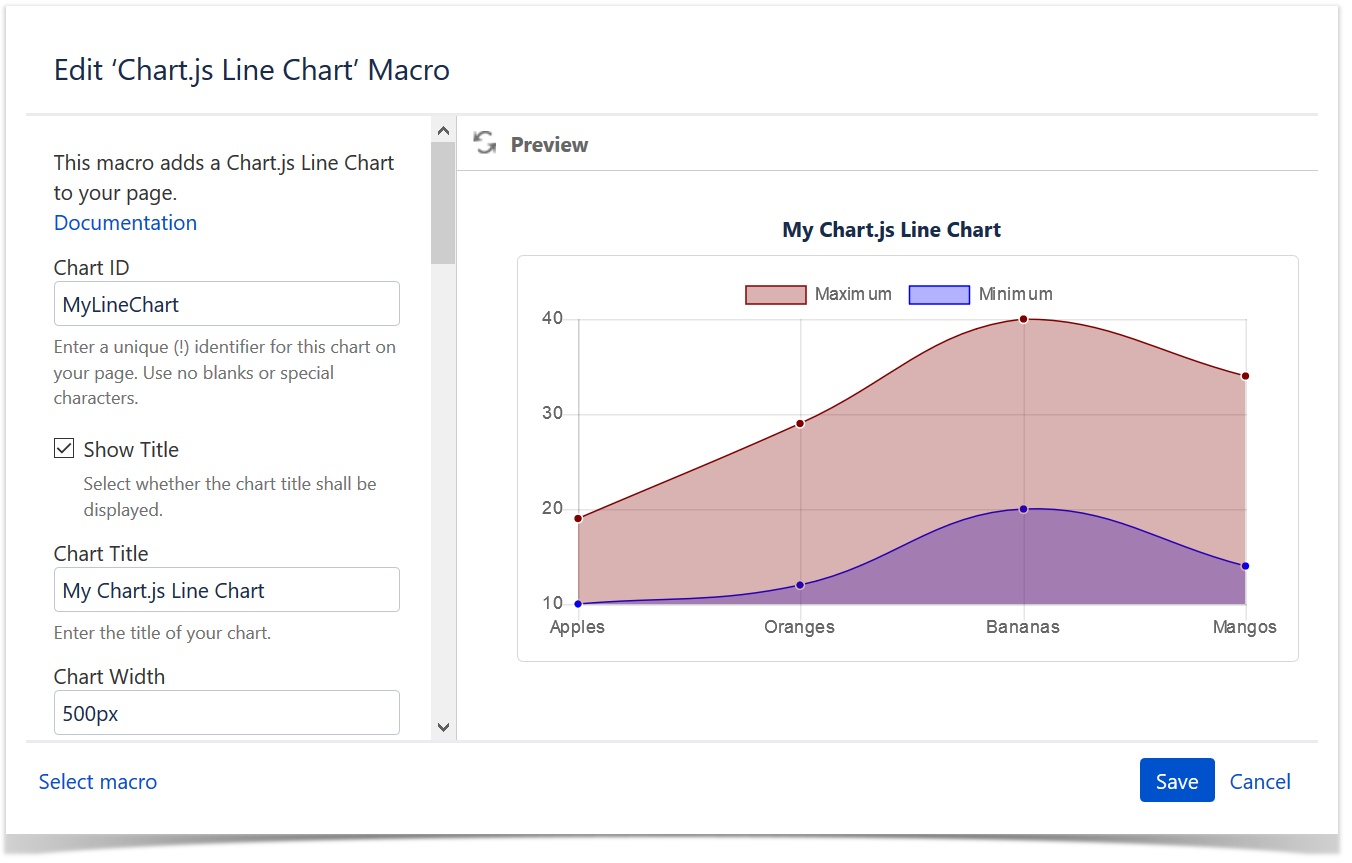
Enter and select the options of the macro
Click INSERT
Put your data table in the macro body
Save the page
Macro Options
| Option | Description |
|---|---|
| Chart ID | Enter a unique identifier for this chart on your page. If you use more than one Chart.js chart on your page, make sure that each one of them has a different Chart ID. Use no blanks or special characters. |
| Show Title | Switch on or off the display of the chart title. If switched on (default), the title is shown above the chart's matrix as shown in the screenshot above: "My Chart.js Bubble Chart". |
| Chart Title | Enter the title of the chart. You can chose to display it or not by the "Show Title" checkbox. |
| Chart Width | This value defines the width of the chart block. The chart itself will adjust to this size. You can enter a pixel (e.g. "500px") or a percentage (e.g. "100%") value. A pixel value will make the block exactly that size, a percentage value refers to the parent block, e.g. a Confluence page section. The default is "500px". Enter the value without the quotes. |
| Chart Border Width | The chart can have a border if you want so. Enter the size of it here in pixel. Enter just the number without the "px", e.g. "1". The default is "1". Enter the value without the quotes. |
| Chart Border Color | If you chose to display a border around the chart, you can enter the color of it here. Enter the hex value of the color starting with a "#", e.g. "#d7d7d7". Enter the value without the quotes. |
| Line Thickness | Enter the thickness of the line in pixel. Enter 0 for none. |
| Point Radius | Enter the radius of the value points in pixel. Enter 0 for none (continuous line). |
| Point Hover Radius | Enter the radius of the value points in pixel when hovered. |
| Point Border Width | Each point has a 1 pixel white border to separate it from the line. You can enter a higher pixel value here. 0 will default to the minimum of 1. (Note: If you want a continuous line, set the point radius to 0.) |
| Point Hover Border Width | Enter the width of the value points when hovered over them in pixel. Enter 0 for no border. |
| Fill Line Area | Select whether to use a background color for the area below the lines. |
| Straight Lines | Check this option if you want straight lines from point to point instead of a Bezier curve. |
| Aspect Ratio | With this option switched on, you can force the height to be the same as the width of the chart (square display). |
| Show Legend | Select whether you want to show the legend or not. |
| Legend Position | Select where to show the legend. |
| Show Tooltips | Select whether you want to show the tooltips when hovering a bubble or not. |
| Show Data Table | Select whether you want to show the data table of the macro body in the page view or not. |
Data Table
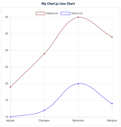
The macro requires a table with your data in the macro body. It needs to follow a certain format. Here is an example used for the above screenshoot:
| Series | Color | Apples | Oranges | Bananas | Mangos | Grapes |
|---|---|---|---|---|---|---|
| Maximum | maroon | 19 | 29 | 40 | 34 | 24 |
| Minimum | blue | 10 | 12 | 20 | 14 | 4 |
Header Row
The table must have a header row. The first two cells are ignored. The rest are used to label line point of the chart.
Rows and Columns
Each subsequent row describes a data series. The label, color and its values.
| Series | Color | Apples | Oranges | ... |
|---|---|---|---|---|
| The label of this series | The color of this line. Use 'random' or one of the web colors. | The first value (its label is taken from the header row) | The second value (its label is taken from the header row) | ... |
| ... |